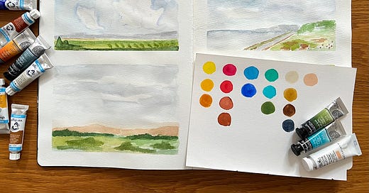
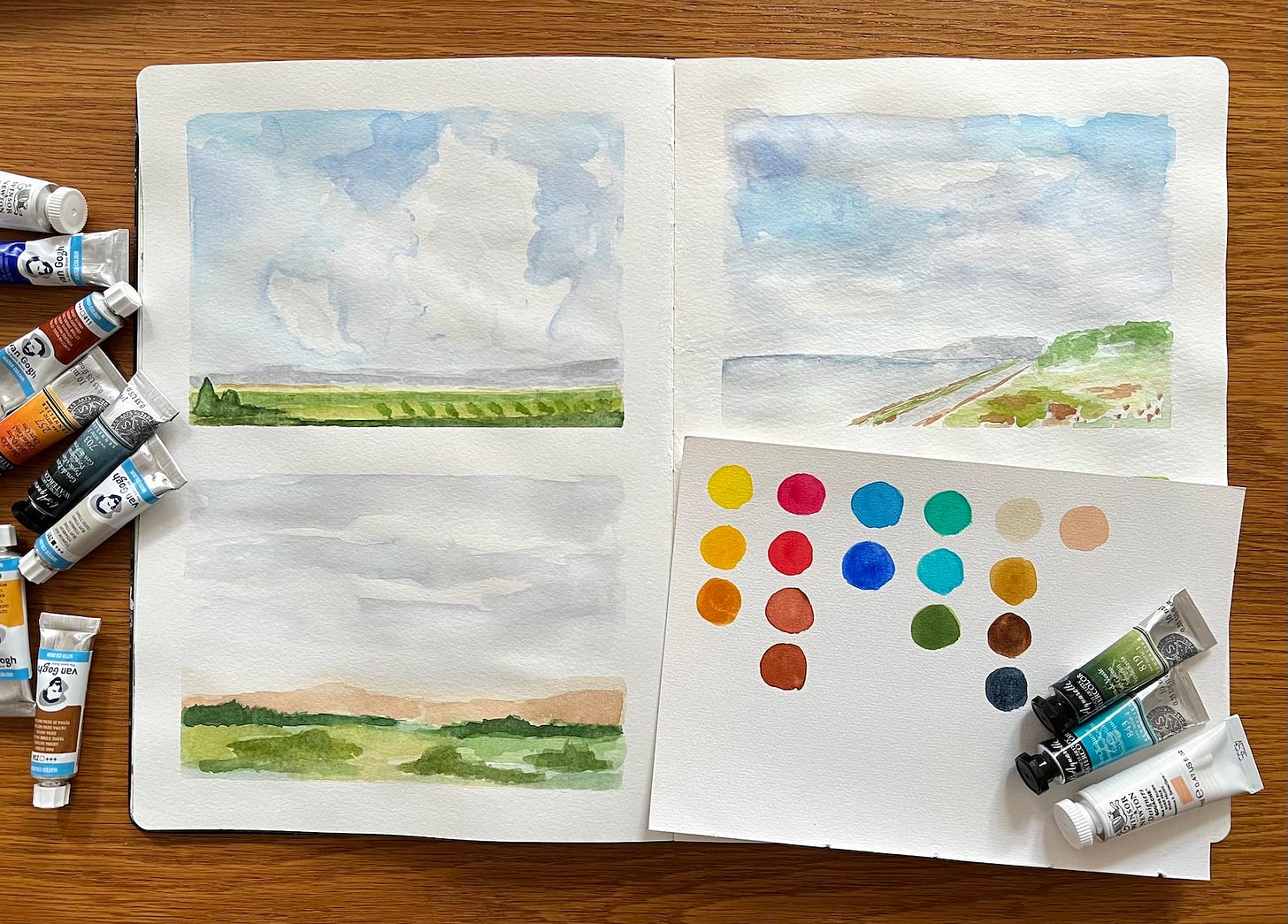
Recently I’ve been using a lot of watercolour in my painting as it is very convenient for short bursts of art practice and working on location. After using student grade paint for a while I decided to update my watercolour palette, so that it now contains better pigments for better results (both painting and mixing).
Last summer I bought a small paint set from Sennelier (La Petit 12 colours) and it worked fine as a part of my travel art kit, but as the paints are not artists grade, I wasn’t exactly happy with using them. Also, I wanted to add some colours (and remove some) to increase the mixing potential and overall usability of my kit.
So, how to choose colours for your watercolour palette?
Before making final decisions I researched multiple sources. I found these most useful for the basic understanding of how to build a palette:
Jane Blundell - Building your palette of colours - a very comprehensive guide, I recommend starting here.
Liz Steel also has a ton of practical information on her site, I recommend checking her articles with the tag “palette”.
I believe this basic principles will work perfectly not only for watercolour, but other mediums, such as oils and acrylics.
Also, the following videos are quite inspiring and offer insight into using convenience (pre-mixed) colours depending on what your needs are:
Laura Horn - Swatching Daniel Smith Watercolours
Sandi Hester - Rethinking the supplies I use
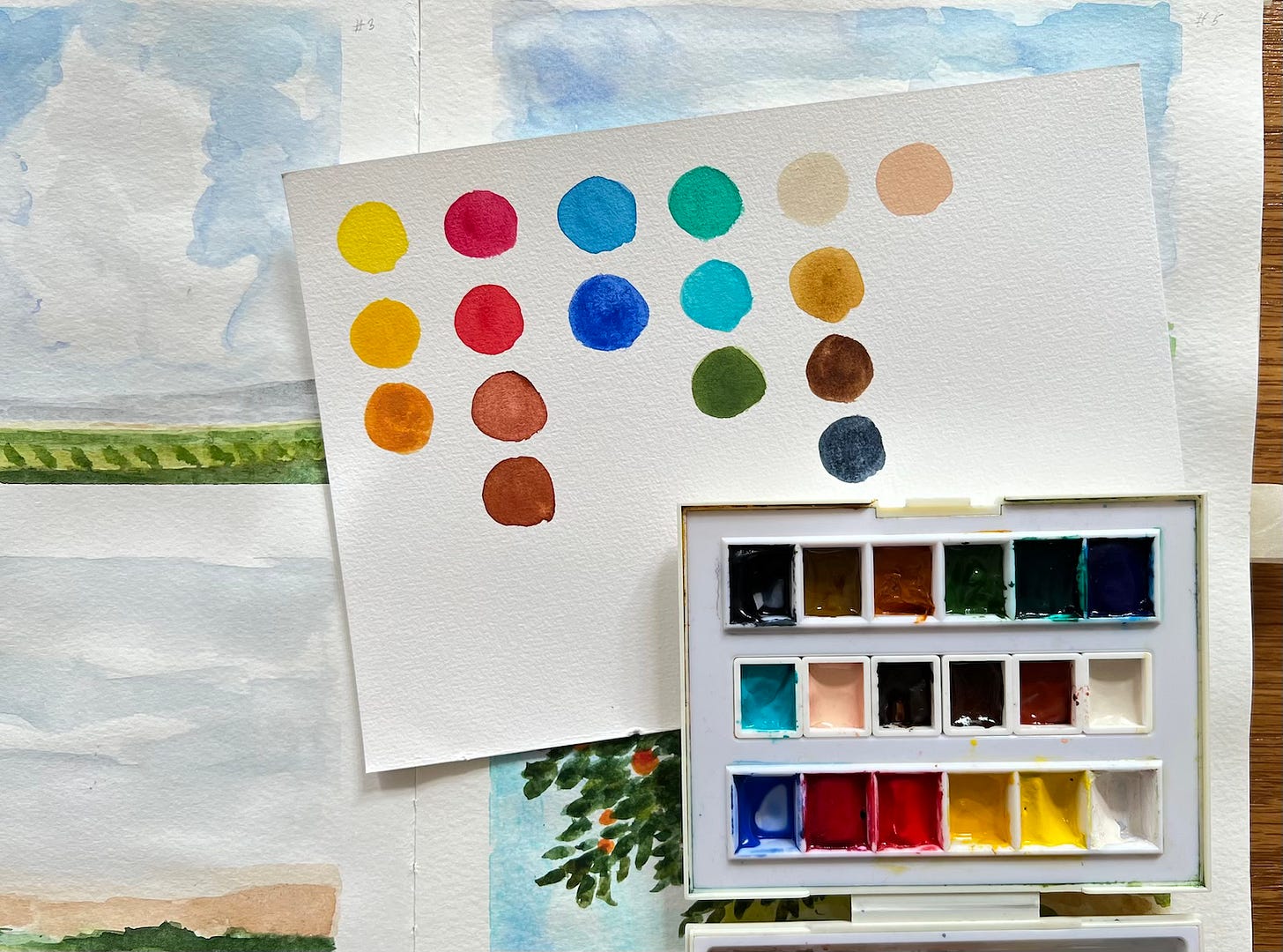
Because my palette is still a work in progress, I decided to use the same box from my Sennelier set and just replace some of the original colours. I added 6 half pans in the central compartment (where you normally store your brush), thus, fitting in 18 colours in total. I use tube colours and let them dry in the pans (sometimes I use them straight from the tube).
My current palette (18 colours)
I kept some of the colours that were originally in the Sennelier La Petite set, because they work quite well at least for mixing and I didn’t want to waste the whole set. The other colours are either from the Sennelier Extra Fine Watercolour1 line, or from Van Gogh. I also have a couple of gouache tubes from Winsor and Newton. At the moment I am mostly working in my sketchbooks, hence I opted for brands that are more affordable (at least where I live!), but still provide artists grade quality and high lightfastness.
Primary colours:
Primary Yellow (Sennelier La Petite)
Azo Yellow Medium (Van Gogh)
Primary Red (Sennelier La Petite)
Rose Madder Laquer (Sennelier La Petite)
Ultramarine Light (Sennelier Extra Fine)
Cobalt Blue Hue (Sennelier La Petite)
Greens:
Phthalo Green (Sennelier La Petite)
Sap Green (Sennelier Extra Fine)
Turquoise Green (Sennelier Extra Fine)
Neutrals and earth colours:
Titanium Buff (Van Gogh)
English Red (Van Gogh)
Burnt Sienna (Van Gogh)
Burnt Umber (Van Gogh)
Gold Ochre (Sennelier Extra Fine)
Raw Sienna (Van Gogh)
Payne’s Grey (Sennelier Extra Fine)
Gouache:
Pale Rose Blush (Winsor and Newton)
Titanium White (Winsor and Newton)
I know that many watercolour artists don’t use white, but I included it, because in some cases I tend to use watercolour a little bit like gouache or fluid acrylics and it comes in handy. I like using warm and peachy pinks and you can easily mix them in a variety of ways, but I decided to have Pale Rose Blush as a handy convenience colour.
I opted for a gouache mainly because I didn’t find a similar colour available in watercolour. The only watercolour alternative I found is from Holbein (Shell Pink), but it’s not available for sale where I live. Keep in mind, that gouache is more opaque than watercolour, but I found that provided enough water is added, it behaves very similarly to watercolour (at least it’s my experience with Winsor and Newton).
Thoughts on a bigger palette
While I think that my current set is pretty diverse and allows for quite a lot of mixing, I still want to add more colours in future and build a 24 colour palette. I want to make something like Liz Steel does using a watercolour tin box.
So why add more colours?
First, I love colour! And convenience colours are called so for a reason - sometimes it’s just more convenient to reach out to a pre-mixed colour and tweak it to your liking, instead of trying to mix a specific colour each time (and you will end up with different results, so it can be frustrating). If you love and use a specific colour all the time and want some consistency, convenience colours are a great solution. You can also make your own mixes (create mixes from tubes and let them dry in pans).
Second, while a triad of yellow, blue and red colours is called “the primary colours” and you are supposed to mix a lot from only this 3 colours (or 6 if it’s a warm + cool primary set), the reality is that colours tend to have much so more nuance in them than just being warm or cool. Experiment with mixing colour wheels using different primaries and you will see, how dramatically the results can differ. Additional colours help to extend the mixing potential of primaries.
Third, some paints are unique single pigment colours, especially earth colours. They tend to be the most natural looking and I find it impossible to mix life-like colours without a nice assortment of earth pigments in my palette.
More colours, be it primaries, convenience or earth colours - all give you more flexibility and mixing potential, but it’s important to say, that you don’t have to have them all.
Moreover, it’s usually recommended for beginners to use a limited palette and first learn more about colour mixing and only after that venture into experimenting with a greater variety of colours - if you need to. Also be sure to include colours that you love.
Some colours and resulting mixes are better for landscapes and florals, other for city scenes, seascapes, portraits and so on. Some artists will create specific palettes e.g. with greys and neutrals to create sketches and value studies. The possibilities are unlimited! I often read from artists, such as Jane or Liz, that with time and practice they learned to limit their palettes according to a specific project they are working on, but it’s usually convenient to have a core mixing palette with anywhere from 12 to 24 colours to start from.
I am going to stick to my current palette for a while and try to figure out, what additional colours can work best for me (and may be rethink and eventually remove some existing colours).
What’s in your colour palette? I’d be happy, if you share in the comments!
Thanks for reading and being here!
Until next time!
Lisa
A side note about Sennelier Extra Fine watercolours - they are honey-based, which means they don’t fully dry in the pans like paints from other brands would (more in this Jane’s post). Personally I didn’t have much problems with this. It may also depend on how moist is the environment. If you live in a drier climate it may not be a problem at all. At my place humidity is on average at 60% and the paint stays a little gooey and sticky in comparison to the other brand I use (Van Gogh), but I didn’t have problems with it leaking. If it’s a concern for you, but you want to try Sennelier, I’d recommend the same as Jane - buy them in pans, not tubes, because they seem to have a different formulation and are firmer when bought in pans.


